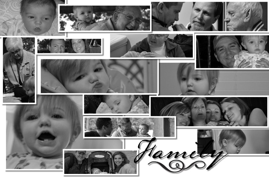
I'm not positive that I like this look....the header needs to change anyway but this background seems awfully busy. I'm thinking of ditching it and quick....any thoughts here.
I try not to make this a fru fru frilly blog even though I'm out numbered but I'm thinking this may be a tad too much.
Monday, February 22, 2010
Subscribe to:
Post Comments (Atom)


2 comments:
There has got to be other options out there...I agree too busy!
Whoever you are...thank you for being blunt with me. I just didn't feel it with the whole quilt look.
Post a Comment